AI logo generator: prompt a usable brand mark
Vlad Aivor · · 6 min read

An AI logo generator can help explore a brand mark quickly, but the useful result comes from a prompt that defines the brand, use case, visual direction, and constraints. For logo work, simplicity, small-size readability, and a strong silhouette matter more than a long list of stylish effects.
- 1.
Write the brief before the prompt
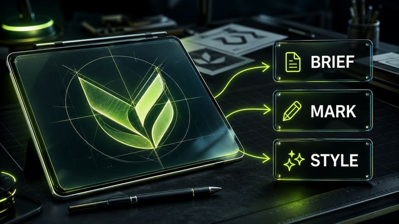
An AI logo generator does not infer business context reliably. Start the prompt with the brand category, audience, personality, and where the mark will appear: website, app icon, packaging, avatar, pitch deck. Avoid asking for a “complete brand identity” in the first render. That is too broad. Ask for one mark for one use case. Example: “minimal brand mark for a studio-booking product, readable as an app icon and favicon.” Opten fits this stage as a prompt checker: it helps you see whether the request is just a mood board or already a usable creative brief.
Before
Make a beautiful logo for a modern brand, premium, minimal, wow.
After
Brief: brand mark for a photo studio booking product. Audience: small businesses and creators. Uses: app icon, website, favicon. Personality: calm, precise, tech-forward.
- 2.
Ask for a mark, not a full identity system
The common mistake is asking the model to invent a symbol, type, slogan, palette, mockup, and ad layout at the same time. For the first pass, constrain the task to the mark: simple brand mark, flat vector shape, no text. Text in AI-generated logos often breaks, so the brand name is safer to add later in a vector editor. If you need a wordmark, make it a separate iteration and quote the exact word. In Midjourney 8.1 this is especially important: it can make a beautiful poster quickly, but the logo itself may become too decorative.
Before
Logo, NovaDesk name, slogan, business card mockup, 3D, gradient, lots of detail, premium.
After
Create a simple flat brand mark for NovaDesk. No letters, no slogan, no mockup. One clear geometric symbol, readable at 32 px, vector-ready silhouette.
- 3.
Add logo-specific constraints
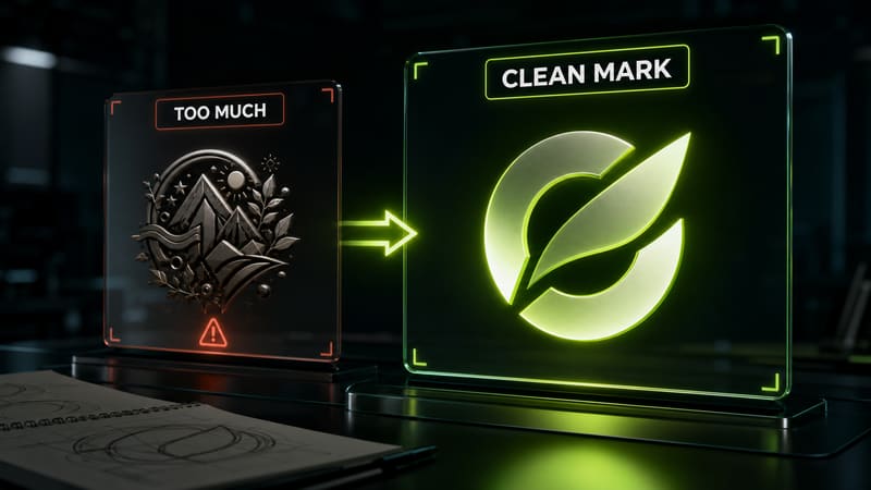
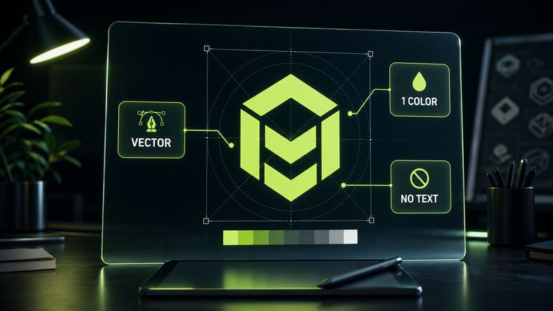
A logo prompt should include the same constraints a designer checks after generation: one primary color, simple shape, clean silhouette, no tiny lines, no photorealism, and no pseudo-3D. In GPT Image 2 and Nano Banana Pro, this block helps keep the output from drifting into a pretty illustration. A reliable phrase is: `flat vector-style logo mark, one-color version must work, no text, no gradients, no tiny details, strong silhouette`. It will not magically produce final SVG, but it improves the chance of getting an idea you can redraw.
Before
Make a logo with neon, glass, complex reflections, depth, details, and dramatic typography.
After
Flat vector-style logo mark. One-color version must work. Strong silhouette, no text, no gradients, no tiny details, no photorealism, no 3D mockup.
- 4.
Fix the first draft precisely
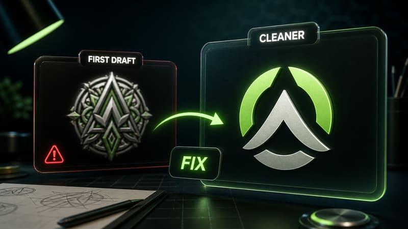
A practical case: in GPT Image 2, the first draft for a fictional product called NovaDesk had an attractive mark, but it contained too many thin inner lines and failed as a favicon. We did not rewrite the whole prompt. The fix was targeted: `simplify the mark, remove inner lines, keep one geometric idea, preserve the desk-and-star metaphor, make it readable at 32 px`. The next draft was less flashy as a picture, but much more usable as a logo. That tradeoff is normal: a logo has to work in a system, not only impress in one large render.
Before
More premium, more details, make it futuristic and impressive.
After
Simplify the mark. Remove inner lines. Keep one geometric idea: desk + guiding star. Strong outer silhouette. Readable at 32 px, no text.
- 5.
Test the mark at small sizes
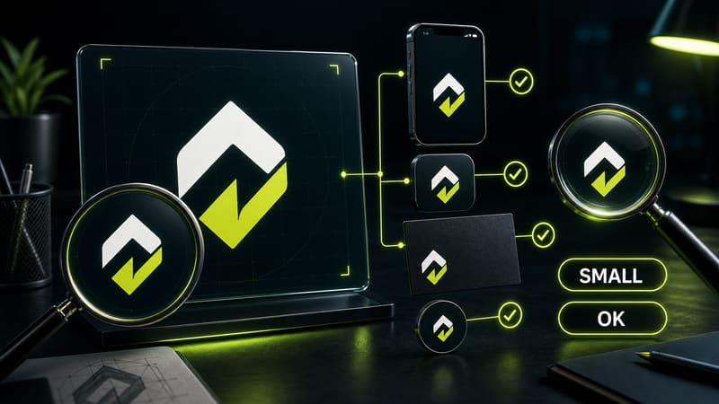
After generation, shrink the mark to favicon, app icon, and small avatar size. If the idea disappears at 32-48 pixels, the prompt was too decorative. In the next iteration, ask for larger visual masses, fewer internal details, and one high-contrast silhouette. For brand work, that matters more than a beautiful mockup on a dark background. Treat the AI result as a concept, then finish it manually: clean geometry, check similarity, build vectors, and test it next to the brand name.
Before
Make the final logo, ready to use everywhere.
After
Next iteration: preserve the main symbol, reduce detail by 60%, thicken the silhouette, test at 32 px and 16 px, no text inside the mark.